
Skittles has always been synonymous with fun and a touch of the unexpected.
Well, the colorful candies that told us to “Taste the Rainbow” recently underwent a rebrand.
In Ep. #204 of the NerdBrand Podcast, we dissect Skittles’ 2024 rebranding, updated visual design, and quirky advertising approach.
Oh, and most importantly, we decide whether or not an individual Skittle is truly called a “lentil.” Let us know your vote!
NerdBrand Podcast Episode #204
Listen to new episodes of the podcast every Friday! If branding, advertising, or nerd culture are your thing, you’ll fit right in. Start listening.
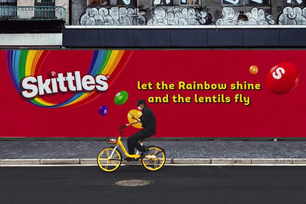
A Bold New Look: Neon Packaging and Sleek Logo
The rebranding, led by design studio Elmwood, introduces us to a kaleidoscope of neon packaging and a sleek new logo. This eye-catching design not only stands out on the shelves but also reflects Skittles’ commitment to staying fresh and contemporary.
“If you can’t have fun as a candy brand, you might want to reevaluate your career choices,” said Mitch Gregory, Creative Director at NerdBrand.
The colors symbolize energy, excitement, and a break from traditional candy packaging norms.
Key elements of the rebrand include:
- Distinctive ‘k’ Letter: The logo features an upward flick on the ‘k’.
- Vibrant Rainbow Icon: The upside-down rainbow icon has been revitalized.
- Dynamic Signature Layout: The iconic lentils now have a flowing visual effect.
- Amplified Typography: The typography, particularly the slight kick on the ‘K’ and the logo’s deeper shadow, enhances brand presence.
Being a fruit-flavored, bite-sized candy doesn’t exactly make them unique in their space.
Skittles realized early on they had to skate near the edge if they want to break through against competitors. They’ve been doing it successfully for at least the last decade.
Embracing the Nonsensical: A Unique Brand Voice
We’ve always known there’s something uniquely funny and a little weird about Skittles.
Gregory recalls a TV spot with two kids under the bleachers eating Skittles off one another’s face as a prime example.
“In that light, this evolution of the messaging and packaging is still very “on-brand” for Skittles,” he shared.
Skittles trades on the bizarre. The redesign embraces this quirky identity, developing a new aesthetic that can only be described as nonsensical — but in a good way!
Key aspects of the new design include:
- Lo-Fi and Quirky Style: Enhancing Skittles’ ability to tell captivating stories.
- Absurdist Visuals: Playful taglines like “taste the rainbow, refresh the rainbow”.
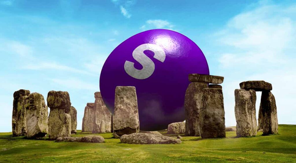
- Iconic Landmarks: Whimsical visuals of lentils descending on landmarks like Stonehenge and The Grand Canyon.
- Engaging and Shareable Content: Designed to be inherently shareable across digital platforms.
Standing Out in a Competitive Market: Skittles vs. M&M’s
Comparisons with other candy giants, like M&M’s, shed light on how Skittles is differentiating itself through its usual boldness and creativity.
The significance of color theory in branding cannot be understated. Skittles has mastered this art by using a palette that evokes excitement and a sense of the extraordinary.
And they’re not afraid to push a few buttons in the process.
A Fresh, Adaptable Design for Skittles’ Global Audience
Created in collaboration with the design studio Elmwood London, Skittles’ new packaging features:
- Fresh Typographic Spin: A new typographic style that adds vibrancy.
- Heightened Rainbow Vibrancy: The signature rainbow is more vibrant than ever.
- Flowing Visual Effects: A layout that adds a dynamic element to the packaging.
Elmwood’s design director, Paul O’Brien, emphasized the importance of creating a cohesive and adaptable design language for a product available in 180 countries. The brand refresh prioritizes the rainbow’s ability to flex and have fun while preserving its iconic Skittles identity for the brand’s global audience.
The Sweet Success of the Skittles Rebranding
Skittles’ 2024 rebrand exemplifies how a well-established brand can successfully reinvent itself without losing its core identity. By embracing bold design, innovative flavors, and savvy marketing tactics, Skittles continues to captivate and inspire.
“They’ve successfully executed a refresh without losing the brand equity they’ve built over the last couple of decades. That’s enviable,” said Gregory.
As the brand navigates the ever-changing landscape of consumer preferences and digital engagement, it sets a benchmark for creativity and relevance in the candy industry.
Fun Facts About Skittles
1) Who makes Skittles?
Skittles is produced by Mars Wrigley, a division of Mars, Incorporated. Mars Wrigley is a leading manufacturer of confectionery, pet food, and other food products, with a portfolio that includes some of the world’s best-known brands.
2) What is the history of Skittles?
Skittles were first produced in the United Kingdom in 1974 and were introduced to North America in 1979. The brand quickly became popular due to its distinctive, colorful appearance and fruity flavors. The original flavors included strawberry, lemon, lime, orange, and grape.
Over the years, Skittles has expanded its product range to include various flavor assortments, such as Tropical, Wild Berry, and Sour. The “Taste the Rainbow” slogan, introduced in 1994, has become one of the most recognizable taglines in advertising history, reinforcing the brand’s association with vibrant, fun, and diverse experiences.
Throughout its history, Skittles has been known for its innovative and often humorous advertising campaigns, which have helped to maintain its popularity across different generations. From bizarre commercials to interactive social media campaigns, Skittles continues to engage us with its unique and playful brand personality.
3) Is a single Skittle called a lentil?
Yes, in the context of Skittles, the term “lentil” is used to refer to individual Skittles candies. This term highlights the small, round, and lens-like shape of each piece, distinguishing it from other types of candy.
4) When did “Taste The Rainbow” become the official slogan of Skittles?
“Taste the Rainbow” became the official slogan of Skittles in 1994. The tagline was introduced as part of a major advertising campaign that aimed to emphasize the colorful and diverse range of flavors offered by Skittles. The slogan has since become one of the most iconic and enduring taglines in the candy industry, helping to solidify Skittles’ brand identity and its association with fun, vibrancy, and creativity.